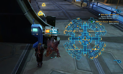
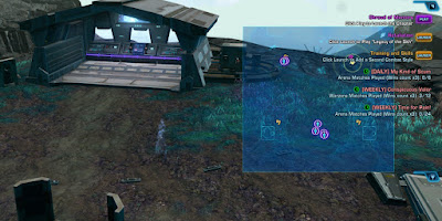
When Bioware announced that 7.2 was going to include changes to the in-game map, I wasn't quite sure what the big deal was. After having played for more than a month after the release of said changes, I have to admit that this update has turned out to be a bigger deal than I expected... but not necessarily in a good way.
Now, the old map is still there, so before you tell me that I could always just keep using that... it's not that simple. You see, there are parts of the new pull-out map that I really like and don't really want to be without anymore! However, there are also ways in which it kinda sucks.
I guess the core problem from my point of view is that I still don't understand what the point of adding this new map was. Best I can guess is that someone at Bioware really hated having both the regular map and a mini-map to deal with and proposed that they could come up with a map design that would be able to fulfil both roles at once.
The thing is, if that was their plan (and it probably wasn't), it failed miserably in my opinion, since the new map falls short both when compared to the regular old world map and to the existing mini-map.
My biggest issue with it when comparing it to the regular map is that it has a single fixed point of view (showing you the current sub-zone you are in) and can't be changed to show you the whole planet or to have a peek into a different sub-zone, so if you want to use the new map to check something like where on the planet to go for a new mission, you're just out of luck and it feels awful.
When compared to the mini-map, it holds up a bit better, but I've found the display of gathering nodes on the pop-out map to be a bit wonky in that it can be hard to judge just where they are relative to your character (and you can't zoom to make it clearer), and if you suddenly find yourself in combat and want to know your enemies' positions, you need to fold the whole thing down to mini-map view again or else you can't see those red dots representing your foes.
So the new map doesn't work as a replacement for either the world map or the mini-map for me, but at the same time I do kind of love it for other things. It's just small and transparent enough that you can keep it up on your screen even while moving around and actively playing, which is very handy for orientating yourself in large spaces. (I'm ashamed to say that even after eleven years of playing this game, I still need to check which section of the fleet has the crew skill trainers sometimes... especially with the way everything is mirrored on Imperial side.)
This is especially handy in PvP, where the new map let's you keep an eye on your team's movements at all times while also staying fully immersed in the match. It's great for guarding a node while also keeping an eye on how the attack is going for example.
Anyway, what all this means is that instead of map usage being simplified and functionality being condensed into a single map instead of two, I now regularly find myself looking at three different maps to check different things, and while that's not the end of the world, it just doesn't feel good either... and considering how often I look at the map in everyday play, I'm getting a lot of opportunities to be reminded of just how clunky I find this new setup.
How have you been finding the new map?


Even before they "patched" the key binds I had re-bound the main map back to M and the new map to Shift+M. I find the new map is really nice for indoor spaces but it's nearly useless outdoors. As you said, the scale makes it hard to use in the open world and also the fog of war. If you haven't revealed a portion of the map yet, the new overlay is so transparent you can scarcely see it.
ReplyDeleteI originally tried to rebind the new map but it kept resetting so that I ended up with both bound to M and one of them just not working. (I know that's not supposed to be possible but that's what happened to me.) Eventually I just gave up on that.
DeleteYou can adjust the opacity of the overlay in the UI editor... though maybe you'd then find the discovered parts of the map too opaque.
I find I mostly use the new overlay map. I've so quickly become used it / depend on it that I swapped the map keys back after the latest patch (7.2b). I'll switch back to the mini map if I need the overlay out of the way or if I need to check on something really close to me. I find I only use the old big map if I need to see the whole planet at once or need to check a different zone. But that's uncommon now.
ReplyDeleteOne bug I have noticed with the overlay is that bonus objectives have tiny map markers if you receive the bonus quest while the overlay is up. A quick toggle to the minimap and back to the overlay fixes that, though.
I am glad they added the overlay, but even more glad they kept the old map, plus kept the options to set your keybinds the way you want in the preferences. That's the flexibility in the UI that I'm happy to see.
I didn't realise just how often I looked at the world map until I was suddenly unable to. Apparently I do it all the time, so not being able to do so on the new map felt like a huge handicap.
DeleteI noticed in PvP that some of my team mates will appear as normal sized icons and some will appear tiny sometimes. I haven't figured out what causes that. I'll have to try the mini-map toggle next time to see whether it works to fix that too.
That map design looks like they lifted it wholesale from TERA and plunked it into SWTOR. Yikes.
ReplyDeleteHm, I've never played Tera, but a quick Google image search for "Tera MMO map" didn't reveal anything that looked even remotely similar to me.
Delete